Maximizing Workplace Safety with High-Impact Safety Signage
July 19, 2022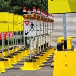
Beyond Warnings: How Effective Signage Maximizes Workplace Safety
July 19, 2022Maximizing Workplace Safety with High-Impact Safety Signage
July 19, 2022Beyond Warnings: How Effective Signage Maximizes Workplace Safety
July 19, 2022A truly effective safety sign doesn’t just grab attention—it’s read, understood, and prompts immediate action. The right combination of clear text, impactful visuals, and strategic color use ensures workers quickly recognize hazards and respond appropriately.
Visibility & Placement: Ensuring Signs Are Seen
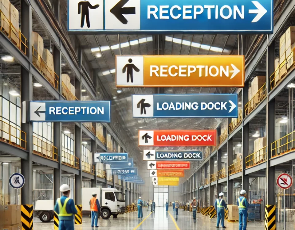
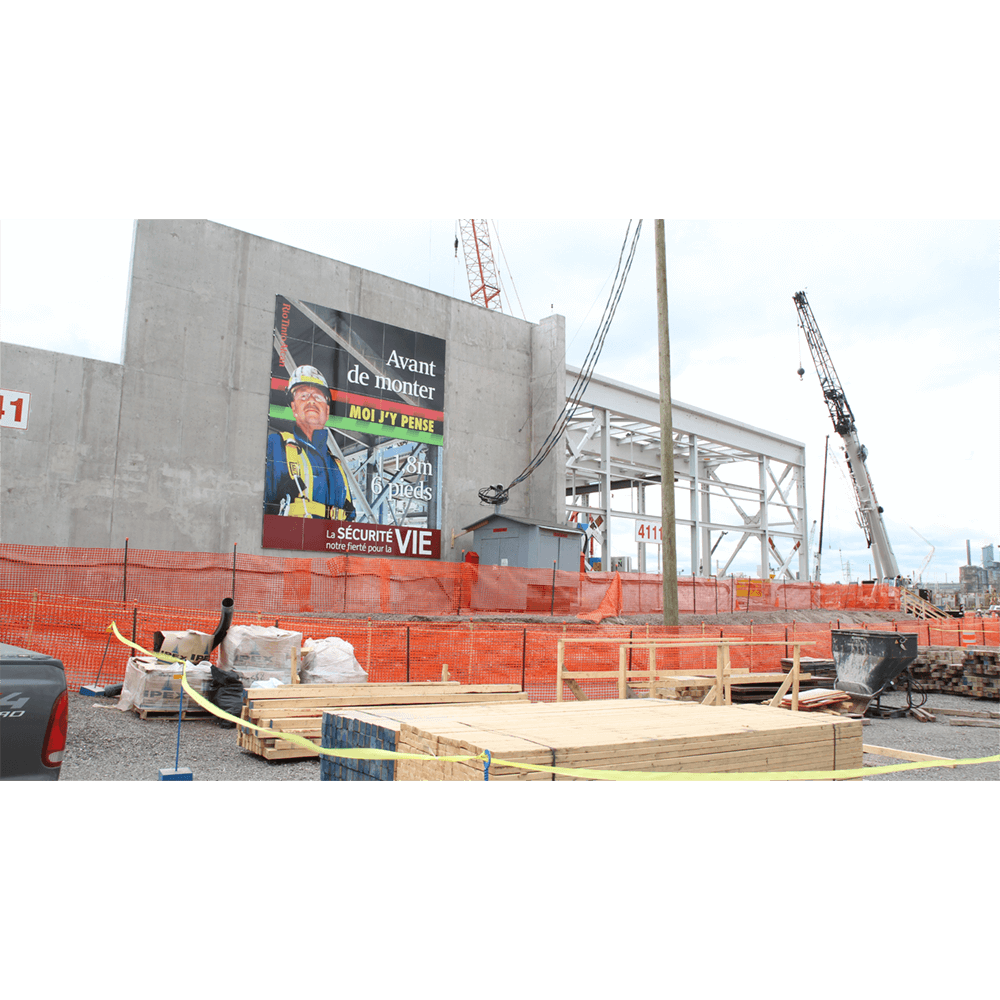
A safety sign is only useful if it’s easily noticed. Even the most well-designed sign becomes ineffective if it’s placed where workers can’t see it. To maximize visibility:
- Position signs at eye level or in direct line of sight.
- Ensure text size is appropriate for the intended viewing distance (e.g., letters should be at least 6 inches high for readability from 200 feet away).
- Use reflective or illuminated materials in low-light environments.
Clear, Direct Messaging: Say It Simply
Safety signs should immediately communicate both the hazard and the risk. Key details should be prominently displayed, ideally at the top, in a clear, legible font. Avoid jargon or cluttered text—concise messaging improves comprehension and response time.
Impactful Images & Pictograms: Universal Understanding
Well-designed pictograms and images reinforce safety messages, making them understandable at a glance. This is particularly valuable in multilingual workplaces where language barriers might exist.
Color Coding for Instant Recognition
Colors help workers quickly assess the severity of a hazard:
🔴 Red – Danger (immediate threats, fire safety)
🟠 Orange – Warning (serious hazards)
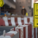
🟡 Yellow – Caution (potential risks)
Your Trusted Partner in Workplace Safety
EZSecur provides expert solutions for workplace safety and signage. Whether you need standard or custom signage, our team ensures your facility meets the highest safety standards. Visit www.ezsecur.com to learn more.