Maximizing Facility Efficiency with Solar-Powered Signs
July 19, 2022
7 Workplace Hazards Every Organization Must Address for a Safer Environment
July 19, 2022
Maximizing Facility Efficiency with Solar-Powered Signs
July 19, 2022
7 Workplace Hazards Every Organization Must Address for a Safer Environment
July 19, 2022In today’s fast-paced industrial environments, signage does more than direct traffic—it plays a critical role in safety and brand reinforcement. Well-crafted signs improve hazard awareness, streamline workflows, and create a professional, cohesive workspace. This guide explores key strategies to enhance industrial signage for maximum visibility and impact.
Modernizing Design for Function and Recognition
Move beyond generic rectangular signs. Advancements in design technology allow for custom shapes, contoured edges, and sleek, modern finishes. Unique sign designs not only draw attention but also reflect your company’s dedication to precision, innovation, and workplace safety.
Designing for Maximum Visibility
Effective signage must be instantly readable. Size, color, and layout should work together to ensure legibility from different angles and distances. By optimizing composition, you enhance both safety and brand presence within your facility.
Keeping Messages Clear and Concise
Too much information on a sign can overwhelm or confuse employees. Stick to essential text and intuitive visuals that communicate safety instructions or directions at a glance. This keeps workplaces efficient and reduces the risk of misinterpretation.
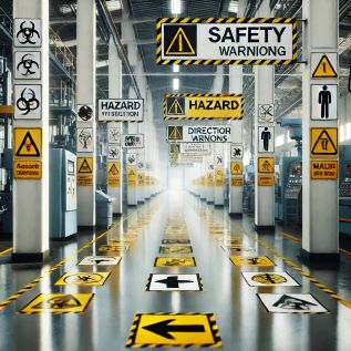
Enhancing Visibility with Contrast and Placement
Lighting conditions, glare, and viewing angles all affect a sign’s effectiveness. Using high-contrast colors and reflective materials ensures visibility in various lighting conditions, while strategic placement helps signs stand out where they’re needed most.
Choosing the Right Fonts and Symbols
Typography impacts readability. Opt for simple, bold fonts, and limit the number of styles per sign to maintain clarity. Additionally, universally recognized icons and symbols can convey important messages faster than words, making signage more effective in high-paced environments.
Strengthening Safety and Branding with Thoughtful Signage
Well-designed industrial signage does more than guide—it protects workers and reinforces your brand’s identity. Implementing these best practices helps create a safer, more professional workspace.
For customized industrial signage solutions, visit EZSecur to explore how we can enhance safety and efficiency in your workplace.


